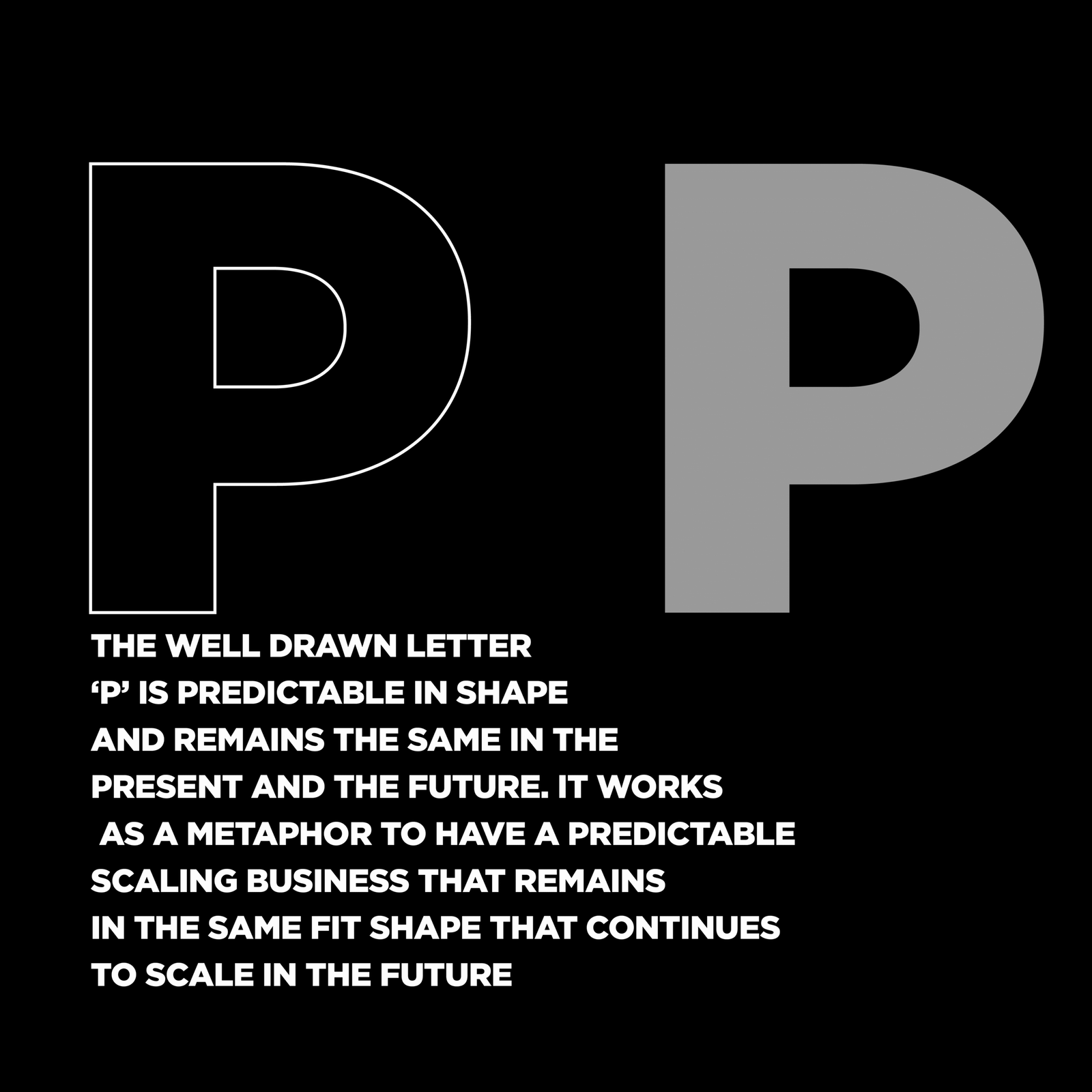
Just as the name of the business is simple and straightforward, telling what the name does, the wordmark serves the same visual meaning showing what the name does.
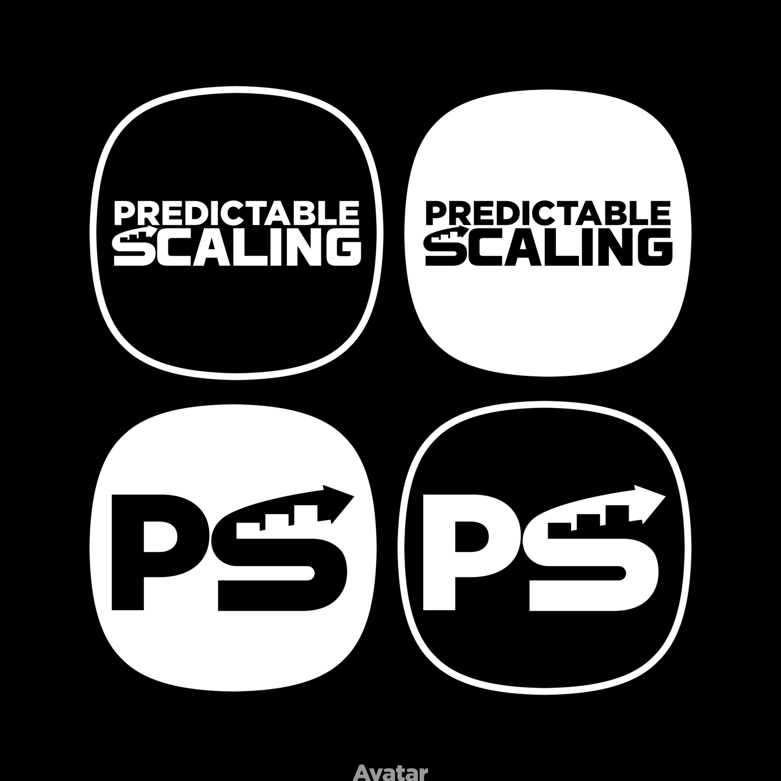
The first brand initial ‘P’ is designed as it is hence quite predictable.
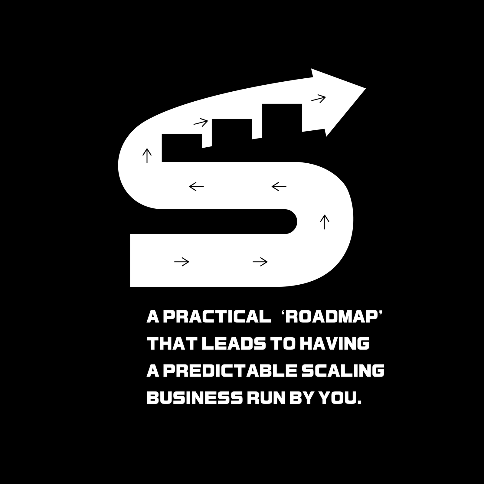
The second brand initial ‘S’ is formed out of a roadmark that guides a business to continue to scale in future.
All the concepts have been developed in black & white to symbolise a black and white freedom framework that turn a chaotic system into a streamlined business.