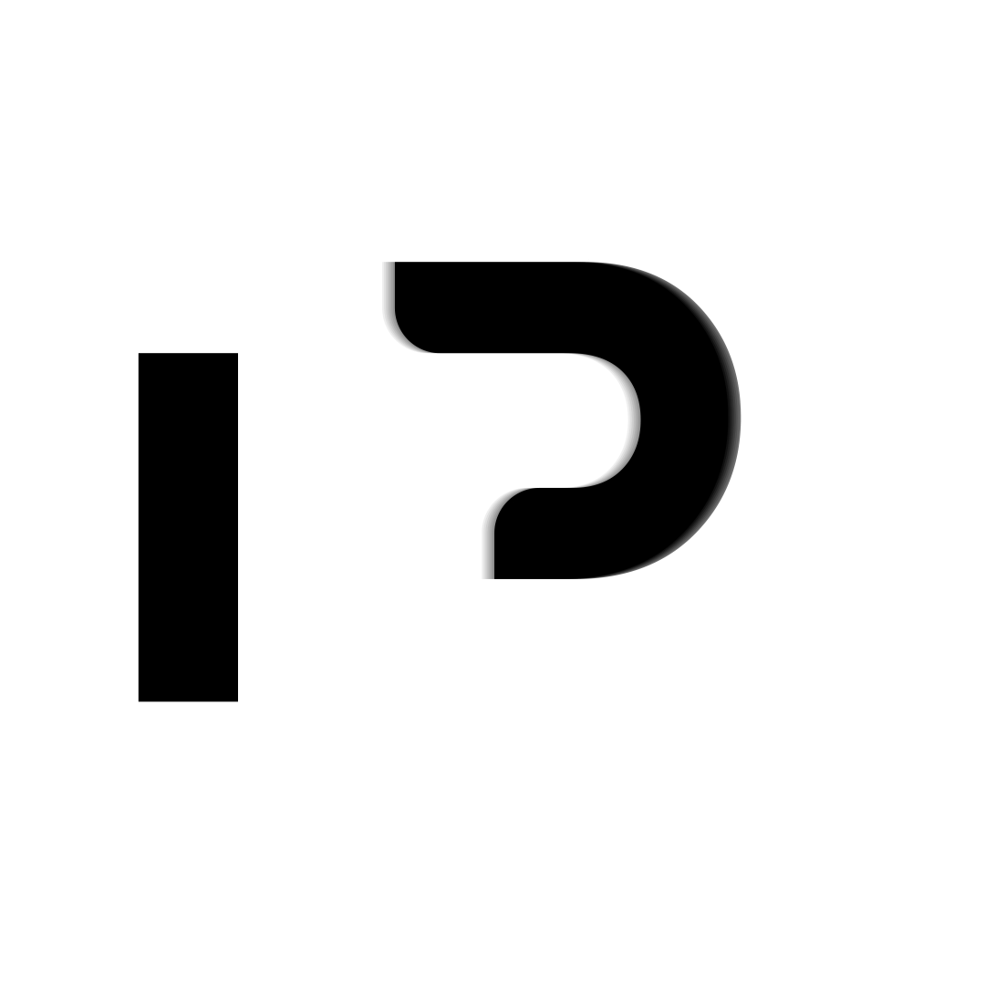
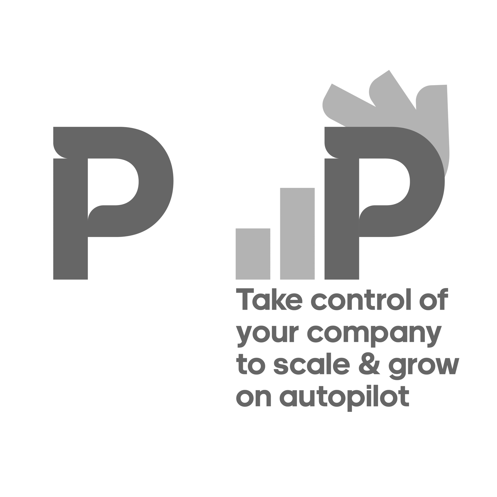
The clean bold simple minimalist logotype serves as a metaphor to reflect and symbolise a streamlined business that scales efficiently and effortlessly.
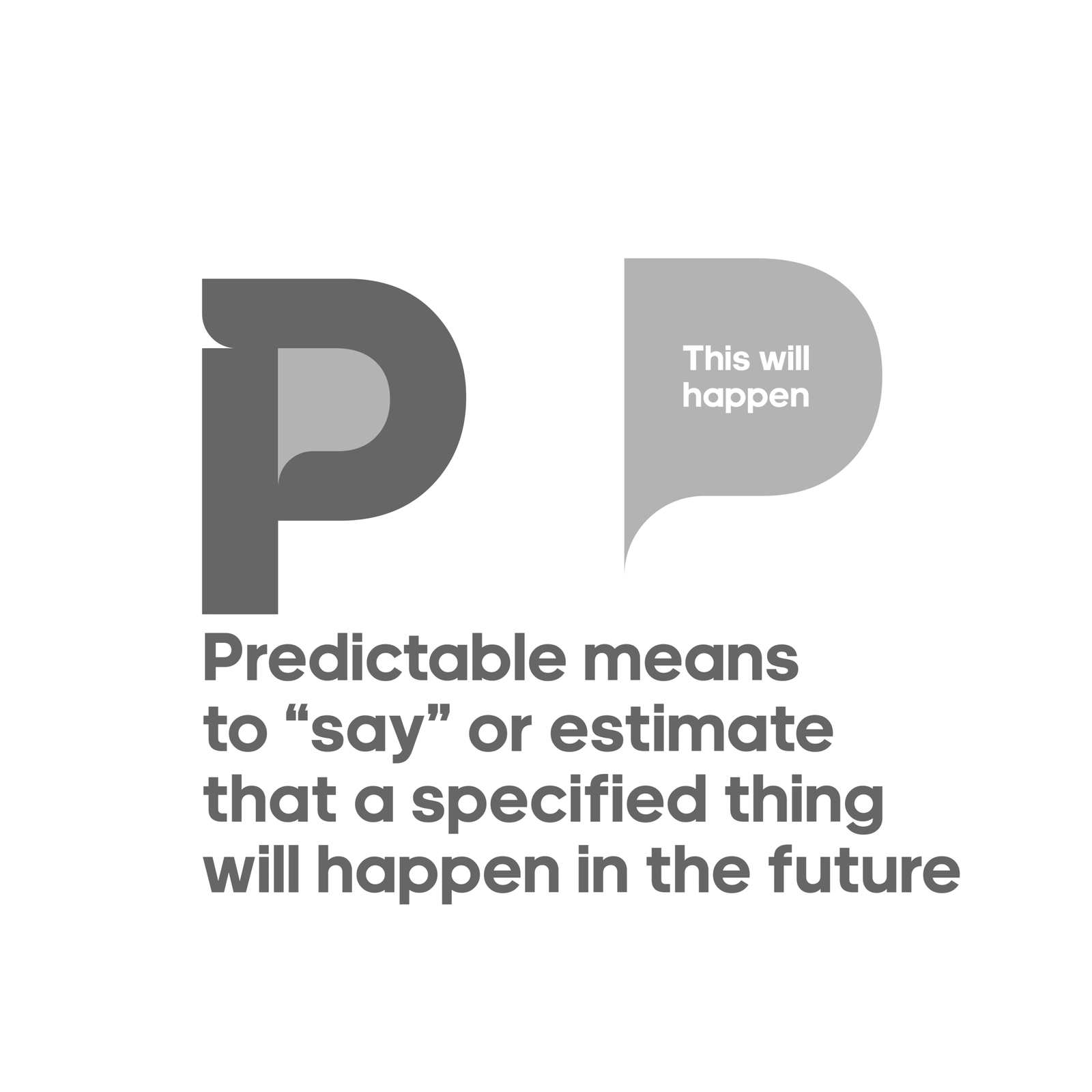
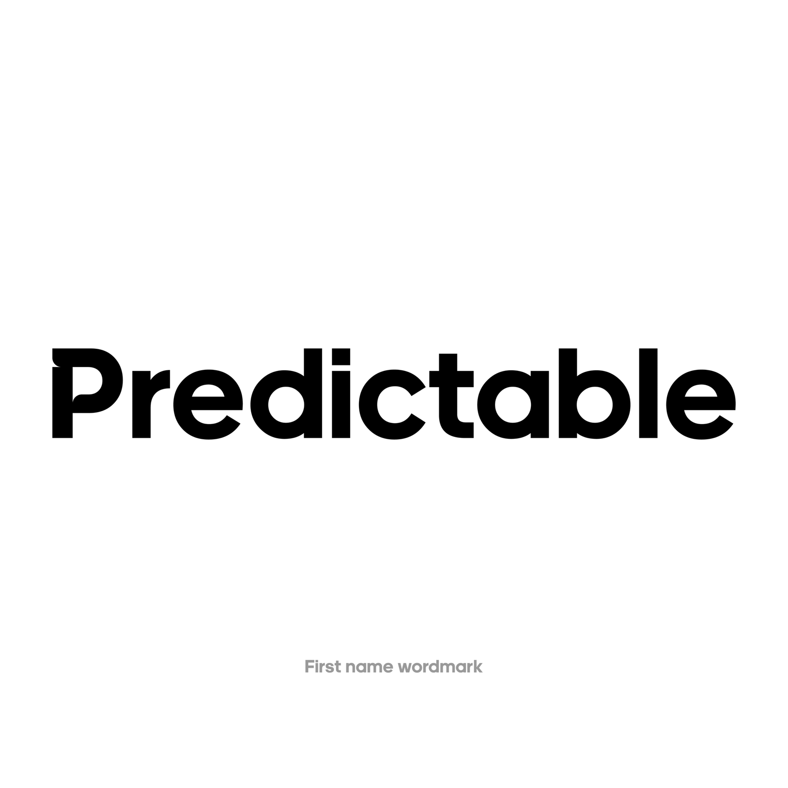
Simple, subtle design touches to the first brand initial ‘P’ gives it depth in meaning showing a hand having control over the business and running it. Also symbolises the hands-on approach to help home service companies to grow and scale.
The subtle speech bubble formed out of accident aids into the meaning of the name ‘Predictable’, which means to say or estimate that something will happen in the future.
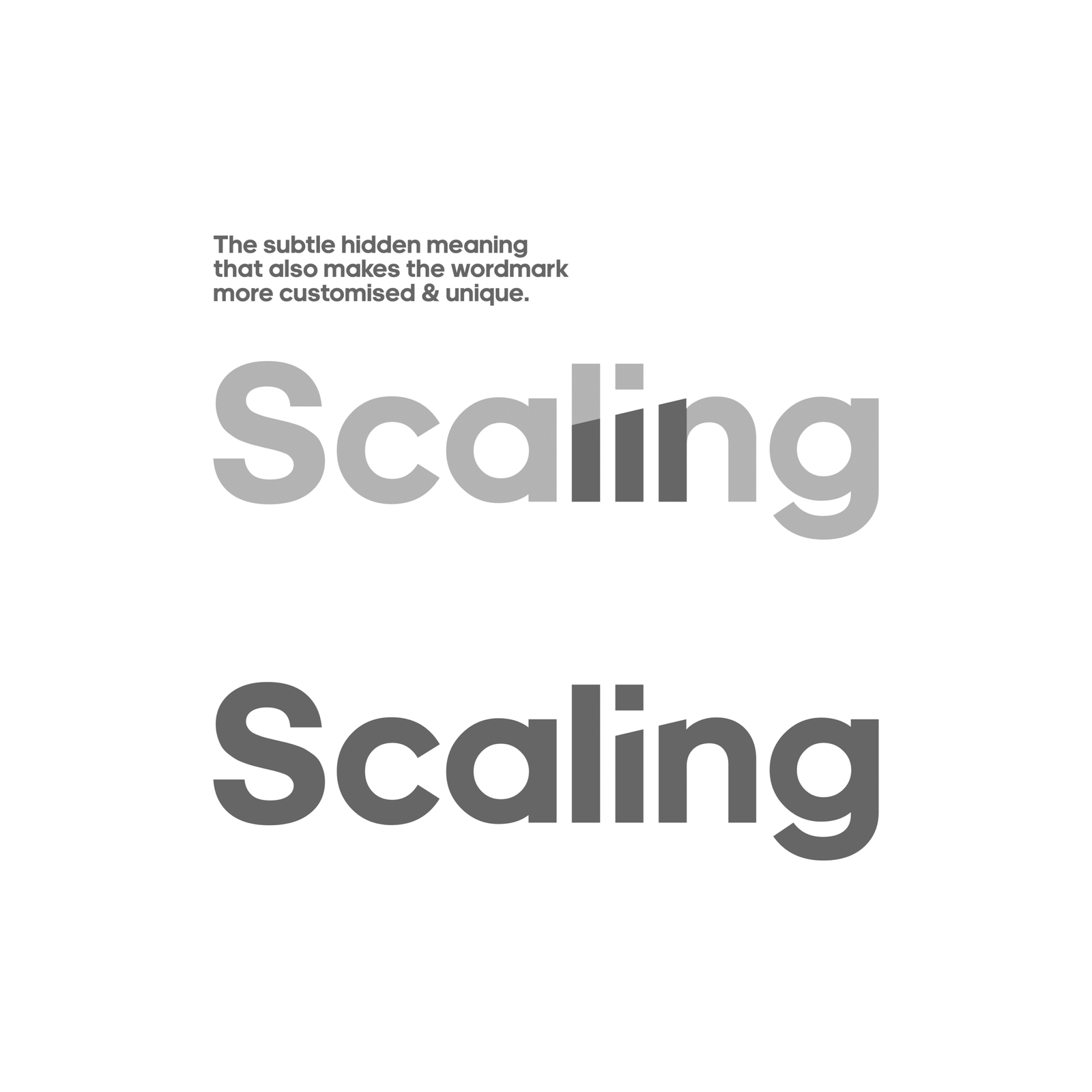
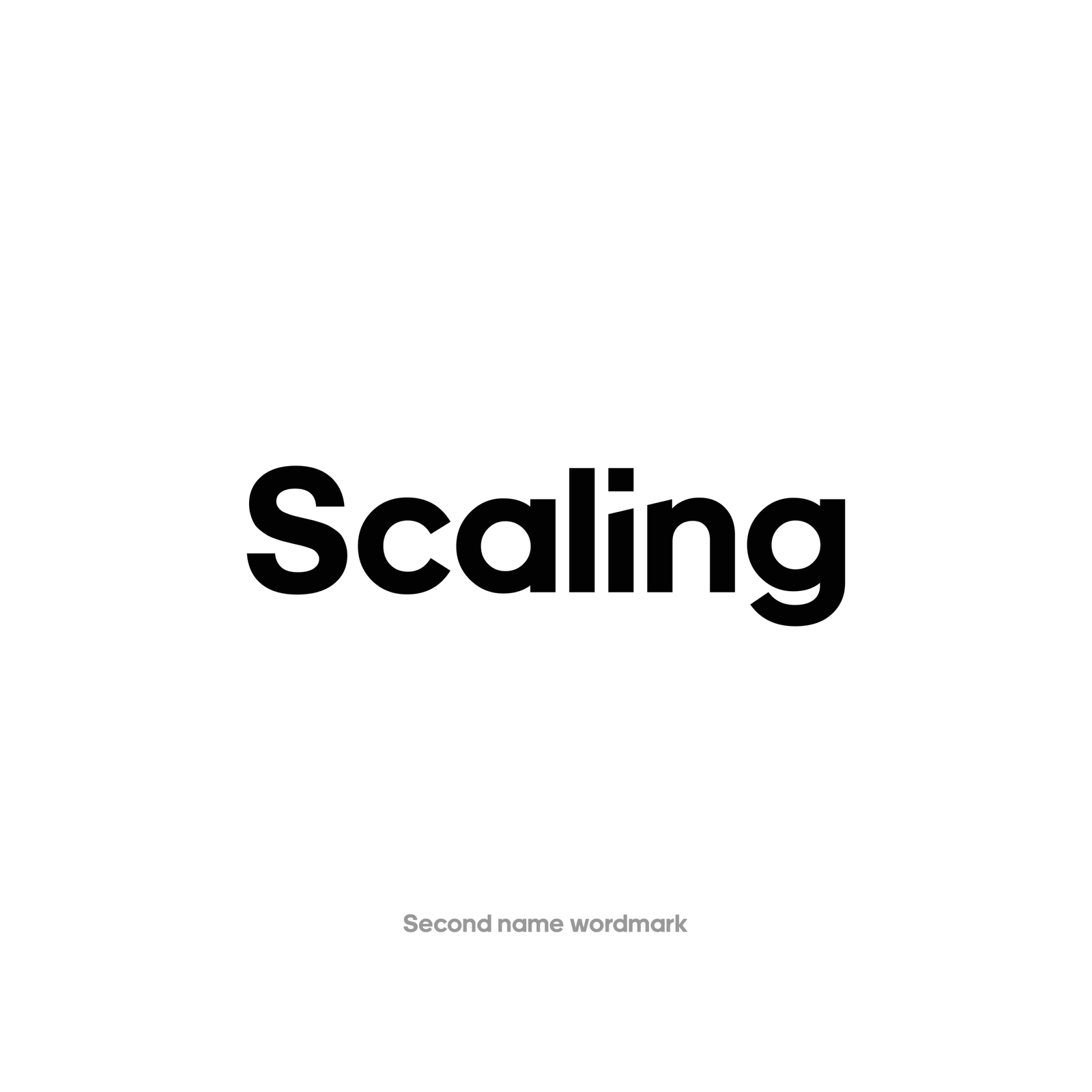
The second name has been minimally touched to have a subtle hidden scaling business symbol within.
The typography for all the concepts has been carefully chosen to make the name aesthetically pleasing, strong, bold, authoritative and legible.